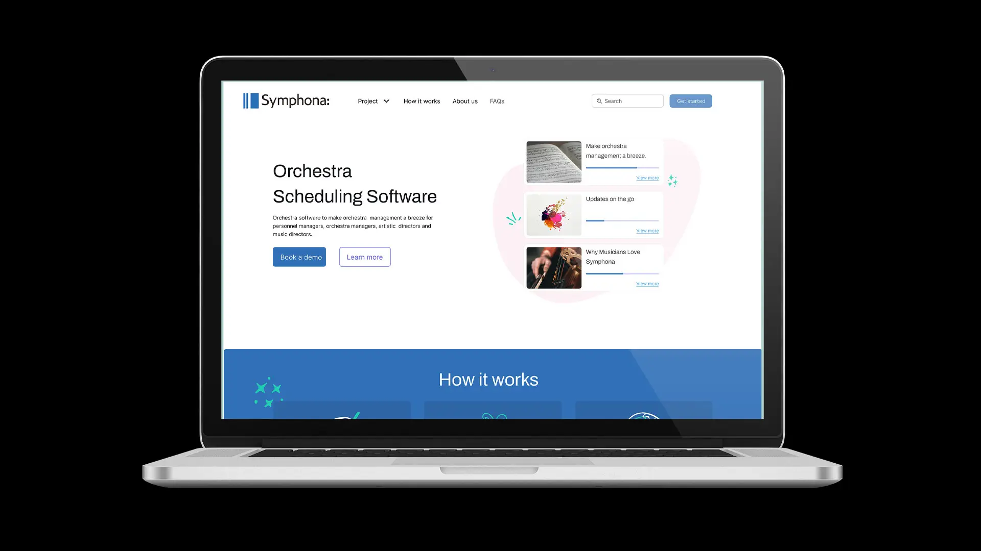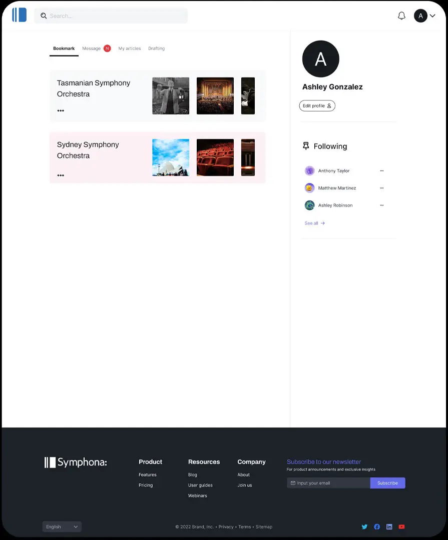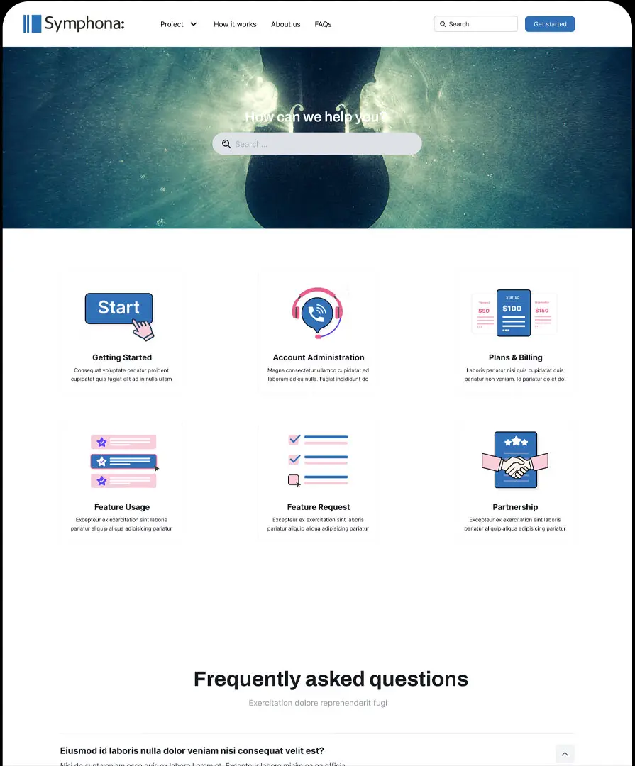
Symphona is a company specialising in rostering software designed specifically for orchestras. Streamlining the complex scheduling needs of musicians and performances.
This software empowers orchestras to manage their rosters efficiently, ensuring seamless coordination and optimal performance planning.
Product Type
Strategy, brand identity design
Client
Symphona Pty Ltd
Overview
Bridging Tradition and Innovation
The challenge was to create an identity that resonated with users accustomed to the traditional design language of classical music while also conveying a modern, innovative product.
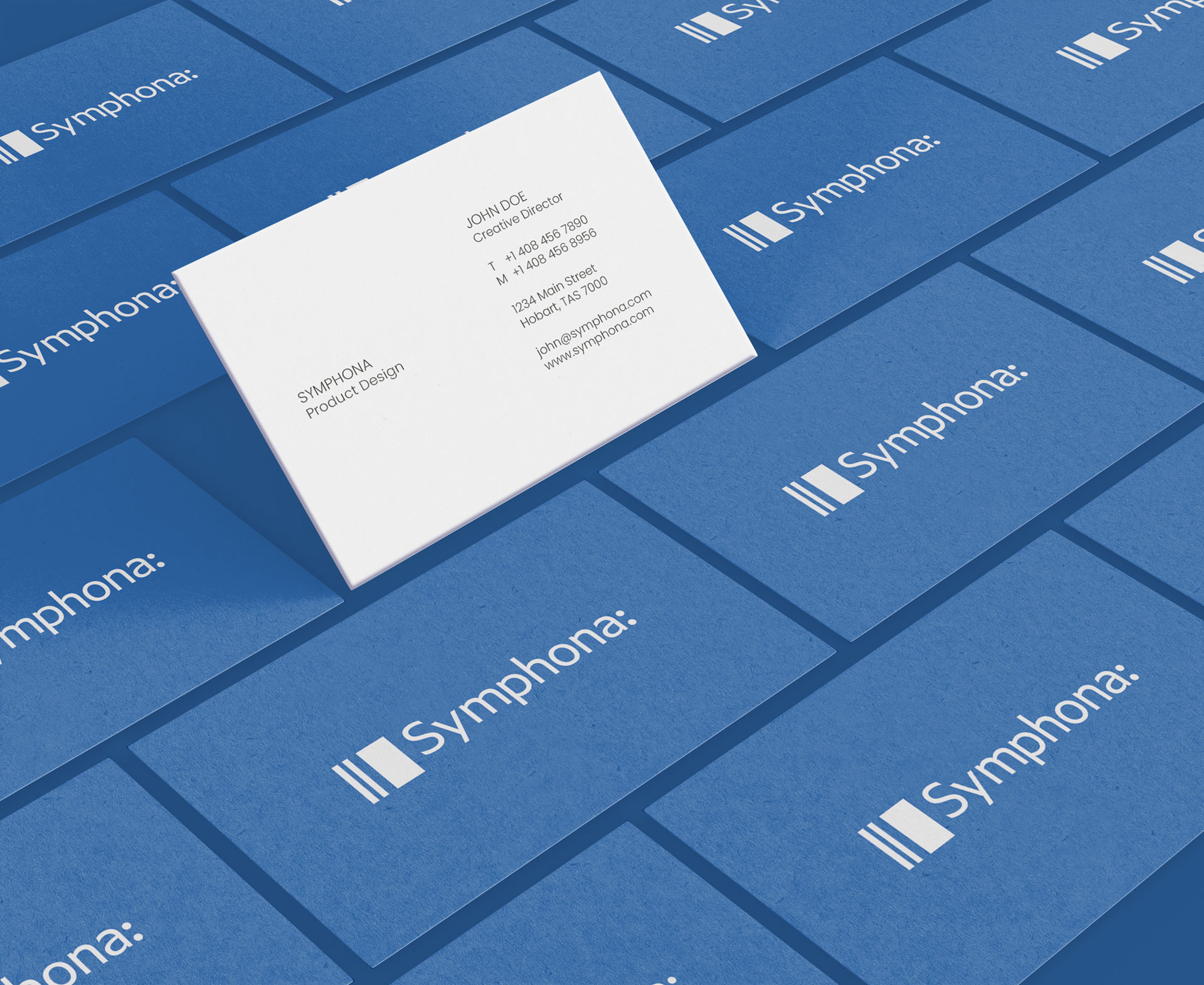
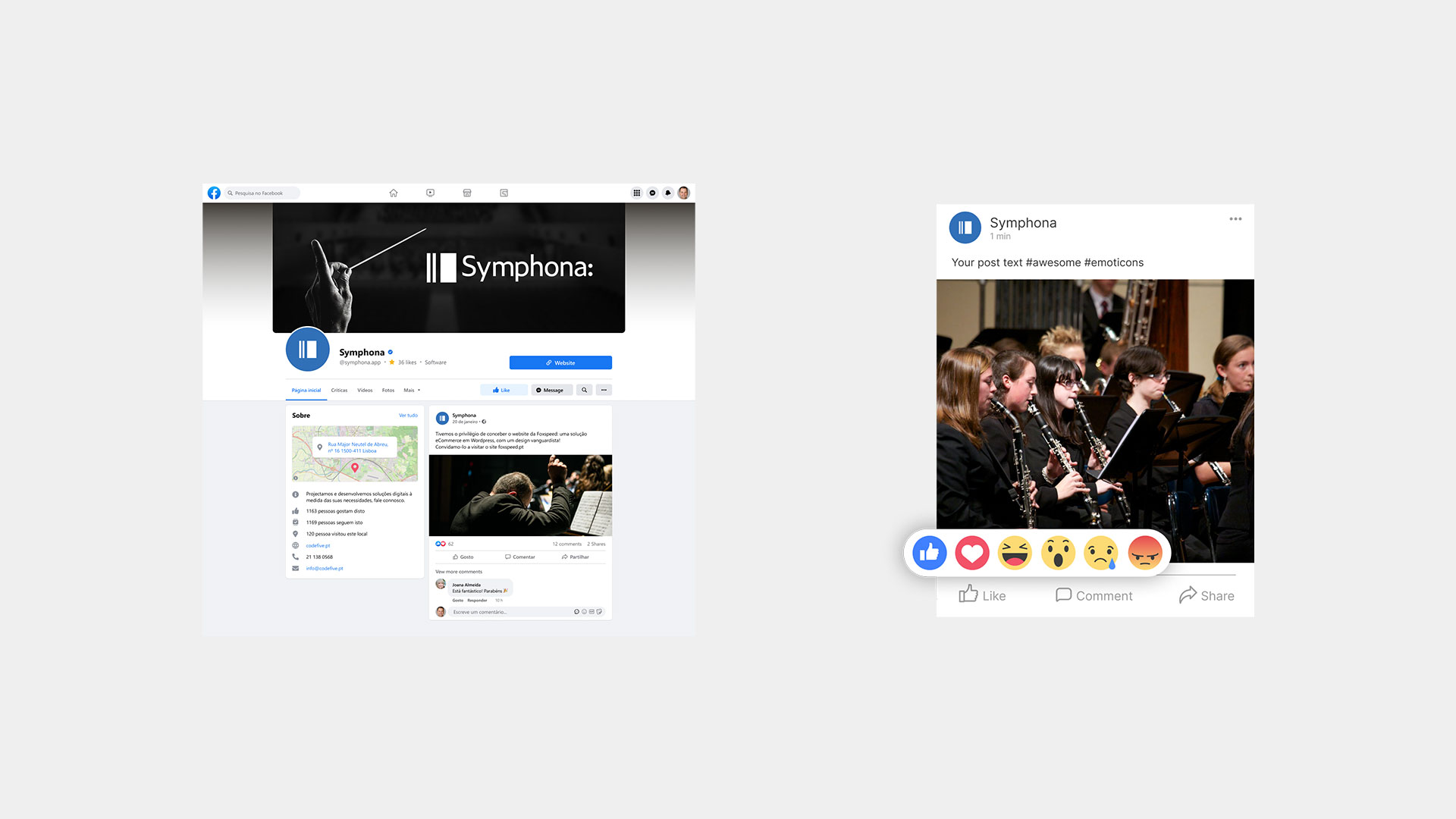
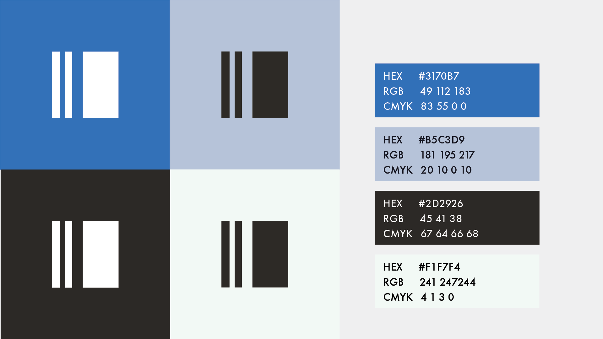
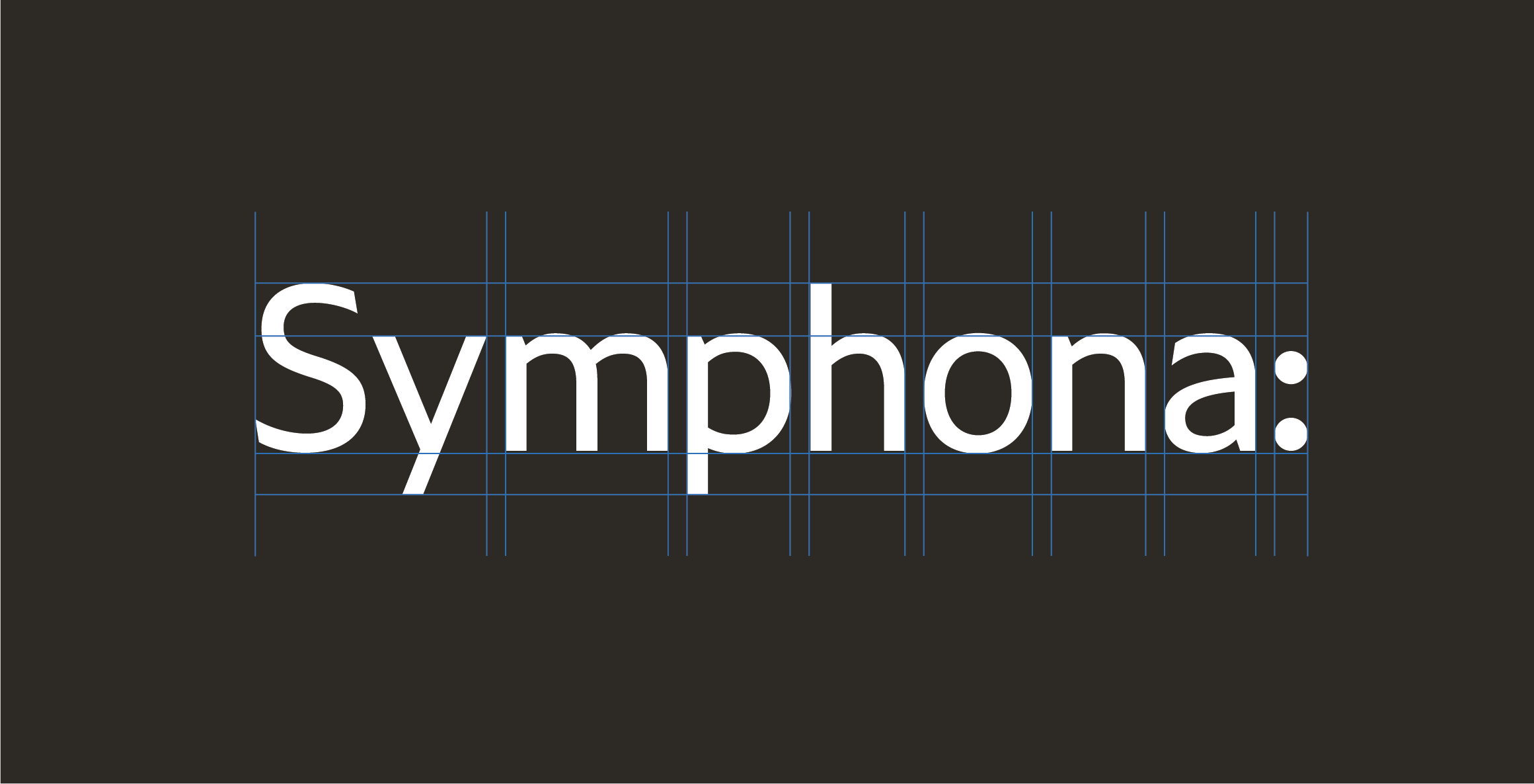
The solution was a logomark featuring an end bar in the negative space, nodding to musicians, paired with a colon after the wordmark, both symbols rooted in musical notation. The colon also hints at organisation, reflecting the company’s passion for developing organisational software and music.

Logomark
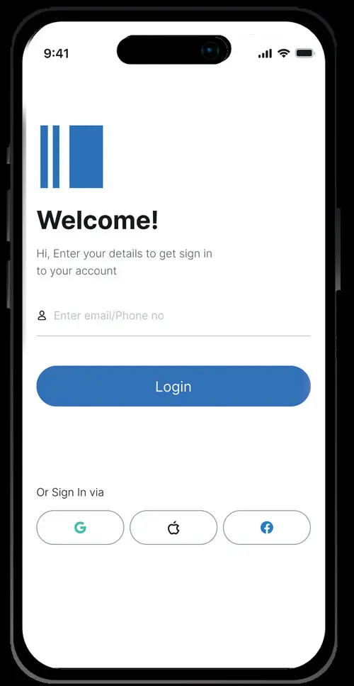
The double bar mark was designed to be used in smaller spaces such as favicons and app icons. Its versatility and uniqueness means is can be used with or separate from the wordmark

Wordmark
This wordmark was designed to show relationship between music and organisation. This can be used with or without the icon mark


